If an MLB franchise with his history as storied as that of the Detroit Tigers can add two new uniforms to their wardrobe this season, maybe it’s time that Your Favorite Blogger updates his look as well…
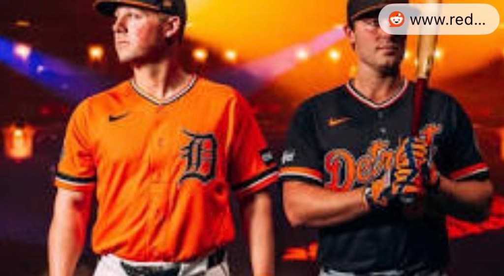
Image Credit: Detroit Tigers / MLB
Over the last several months, I’ve been experimenting with the evolution of AI. What started with ChatGPT has, for the last few months, shifted to Google Gemini. You’ve likely noticed the AI-generated feature art appearing more frequently on this blog. When I launched Season 2 of the podcast a few months ago, I worked with Gemini to develop a new visual identity. For the two of you who listen, you’ve already seen the “Hero” mark:
I sometimes think I missed my calling in marketing. It’s a hobby of mine, so it’s no surprise that Kid 2 is also obsessed with corporate and sports logos. I’m drawn to this imagery because it evokes the “Socialist Realism” and propaganda poster styles of the 20th century. I chose the red fist because red is a primary color of action, and the weathered, “exposed to the elements” texture suggests the grit and endurance required for this journey.
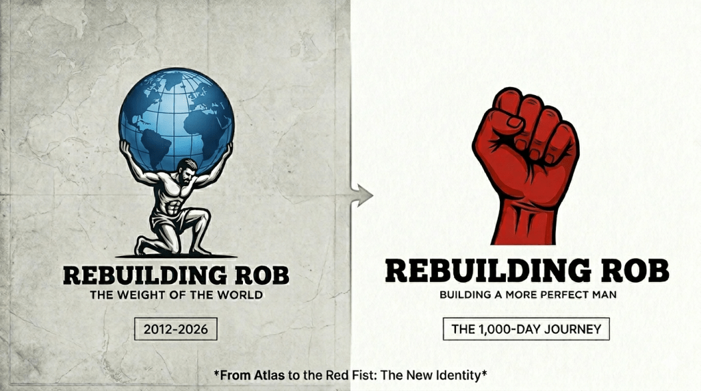
A Proper Send-off for Atlas
For over a decade, this was the face of the blog. I originally chose an Atlas-style logo because I liked the idea that it represented the literal “weight of the world on my shoulders.”

It was a powerful image for where I was, and it served its purpose perfectly for thirteen years. But as I look toward the horizon, the tone of this blog has shifted. I’m no longer just documenting the burden of being Rob. I’m becoming more proactive and assertive. I’m taking charge.
The New Standard: The Empty Red Fist
The Empty Red Fist represents that agency perfectly. It is the visual shorthand for the “100% Policy”—raw endurance and the internal strength required to choose oneself. This is now the primary mark of the Rebuilding Rob brand.
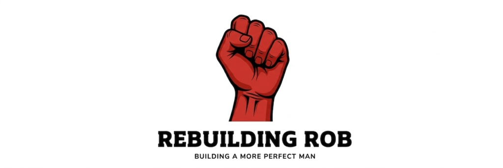
The “Pure Endurance” logo—the new primary mark of Rebuilding Rob.
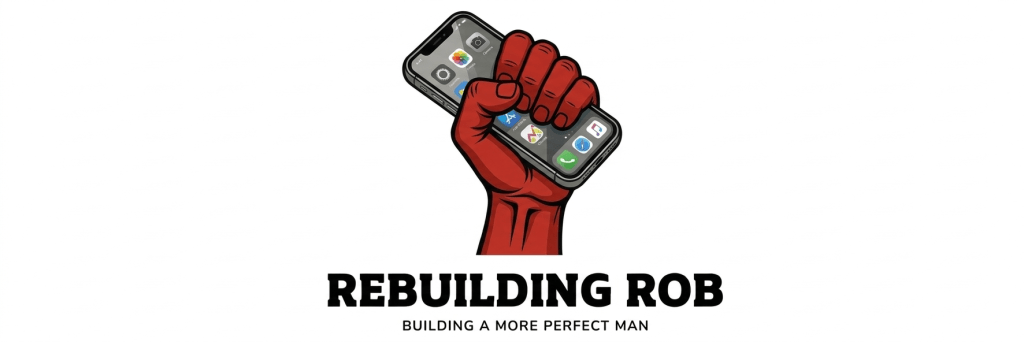
The 2026 Alternate Kit
Of course, just like the Tigers, a modern brand needs a full kit. While the empty fist is the foundation, I’ve developed two “Alternate” versions to represent the tools I use to do the work. Since the vast majority of my writing now happens on my smartphone rather than a tablet or PC, this version is perhaps the most apropos for the daily grind:
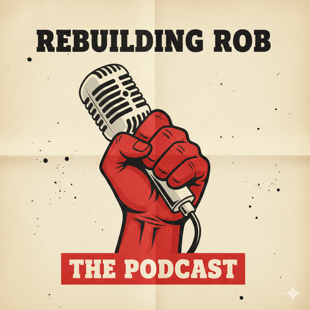
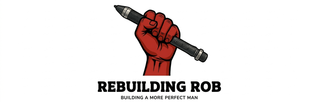
And for those moments of deep-dive creativity—the long-form essays and “Audacity of Potential” projects—we have the tool of the trade:
It’s a new season, a new kit, and the same commitment to the work. Happy Home Opener, Detroit.
Thanks for stopping by Rebuilding Rob. Be sure to like 👍, comment and subscribe below. It’s greatly appreciated! Also, feel free to follow I’m me on social media and check out my recent posts!
- From Atlas to the Red Fist: Why the Detroit Tigers’ New Kit Inspired My Own
- Wait, we’re the same age?
- Rob Reviews: Daredevil: Born Again, episodes 2.2 and 2.3
- Artemis II: The Audacity of Human Potential
- Episode 7: The Teacher Armor is now LIVE!
AI images created with Google Gemini
The article “From Atlas to the Red Fist: Why the Detroit Tigers’ New Kit Inspired My Own” first appeared on Rebuilding Rob

Leave a comment